Hello. I'm Kiraku, an engineer working on the Yahoo! JAPAN News website.
In May 2020, Google released the Core Web Vitals, which indexes user experience with web pages. In this article, I would like to talk about how the Yahoo! JAPAN News engineer team improved our Core Web Vitals and those achievements.
What are the Core Web Vitals?
Have you ever experienced a problem when you were browsing a web page, for example, the content displayed slowly, the response to a scroll or click was slow, or the position of an element you wanted to click slipped out of place because of the page layout changed during loading? These problems contribute to poor user experience. The Core Web Vitals allow you to check such problems pertaining to user experience with the following three metrics:
- LCP (Largest Contentful Paint): Loading
- FID (First Input Delay): Interactivity
- CLS (Cumulative Layout Shift): Visual stability of page content
In order to provide a good user experience, it is important to improve the values of these three metrics. This article doesn't go into detail about the Core Web Vitals. For more information, please refer to the article indicated below.
The following article announces that the metrics will affect search rankings on Google Search from May 2021. The article explains that, the higher the Core Web Vitals, the better the user experience, and also announces that the Core Web Vitals will be included as search ranking determinants, so it's a good idea to improve the metrics now.
- Official Google Webmaster Central Blog: Timing for bringing page experience to Google Search (external website)
How to check your Core Web Vitals
You can check your Core Web Vitals in several ways. We checked our Core Web Vitals using three tools:
1. Google Search Console
You can check which pages have problems and how many problems there are on pages with the Core Web Vitals on the Google Search Console. If you have Google Search Console installed, you can easily check this.
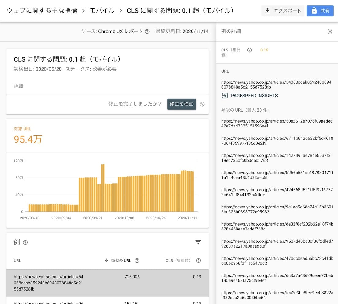
Checking the Core Web Vitals on the Google Search Console
The data displayed is based in the Chrome User Experience Report, which indicates the daily totals of the Core Web Vitals Google receives from Chrome users. On the Search Console, URLs for pages with problematic metrics are grouped by path. You can check up to 20 URLs on one path. 20 URLs may be sufficient in some cases, but we wanted to know our Core Web Vitals for our respective URLs, so we decided to use a JavaScript library called web-vitals to measure our Core Web Vitals by URL.
2. Lighthouse
Lighthouse is a performance measurement tool you can use as a Chrome extension or you can run on the command line. From measurements, Lighthouse offers some advice for performance improvement. And, for example, for one of the Core Web Vitals, CLS, the item "Avoid large layout shifts" shows you elements that cause a layout shift.

Lighthouse allows you to easily make performance measurements, but for elements that cause a layout shift, it can check the elements used only while the page is initially loaded. For CLS, layout shifts that occur after the page is fully loaded are counted, so Lighthouse is unable to detect some elements that cause a layout shift. With web-vitals (JavaScript library), you can get more detailed measurements for CLS.
3. web-vitals (JavaScript library) and in-house analytics tool
web-vitals is a JavaScript library used to measure the Core Web Vitals. We visualized Core Web Vitals score reported by web-vitals using in-house analytics tool. It enables us to obtain more detailed measurements for the Core Web Vitals than those available on the Search Console. Note that when measuring the Core Web Vitals, taking account of the possible impact on beacon servers at a traffic spike, the amount of logs to check, and other related factors, our analytics tool is designed to analyze logs, sampling 0.1% of all logs.
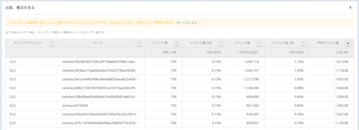
Analyzing the Core Web Vitals using in-house analytics tool
Due to the specifications of the analytics tool, the CLS values indicated above are multiplied by 1000.
As a result of checking our Core Web Vitals using these tools, we found that our Yahoo! JAPAN News pages need to be improved with regard to CLS (visual stability of page content). Poor CLS values indicate a layout shift that occurred on a page. Layout shift is one problem that needs to be solved because it worsens user experience, for example, it causes the element you want to click to slip away on a page you are displaying. To solve a layout shift, you need to identify which element on the page is causing it.
Identifying the element causing a CLS problem
We found that our poor CLS value was caused by a page containing the body of an article. To solve the problem, we first needed to identify which element on the page caused the layout shift, and we did this using Chrome DevTools.
Click Rendering in More Tools in the Kebab menu in the upper righthand corner of Chrome DevTools; this displays the Rendering tab. If you check Layout Shift Regions in the pane, you can visually check the element that caused the layout shift to occur, which will be highlighted in blue.
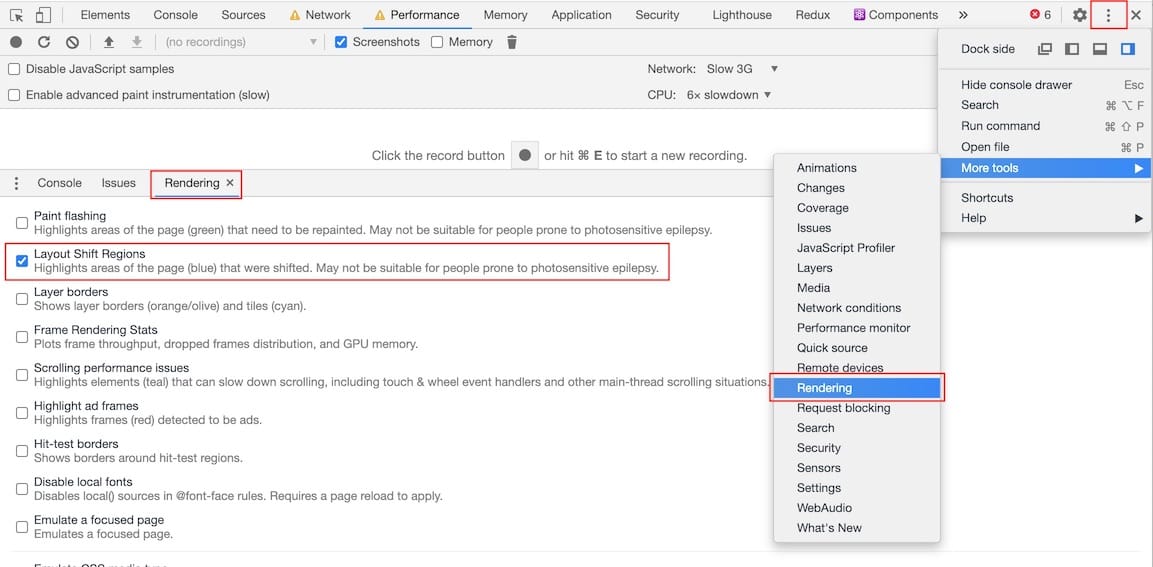

A layout shift may be difficult to reproduce in a high-speed network connection or when sub-resources in the page are cached. In such a case, it is recommended to slow down the speed using Network or CPU throttling settings in the Performance tab on Chrome DevTools, or check Disable Cache in the Network tab to disable the cache. For the setting locations, see the picture below.


In addition to Chrome DevTools, you can use the PerformanceObserver API to identify elements that are causing a layout shift. With the following bookmarklet, you can see the elements causing a layout shift in the browser console. Bookmark this for easy access to it.
javascript:try{new PerformanceObserver(e=>{for(const o of e.getEntries())console.log(o)}).observe({type:"layout-shift",buffered:!0})}catch(e){}
We checked our pages by using these tools and found that a layout shift occurred in above the fold when the image to be displayed above an article was loaded.
The CLS value is the total of the values for all layout shifts caused by not only elements in above the fold, but elements when the page is scrolled down, and while the page is displayed. So, basically, we needed to solve the problematic elements that function in above the fold and all other elements, but we first determined to solve the layout shift in above the fold because of cost-effectiveness.
The page had the layout shift as illustrated below:
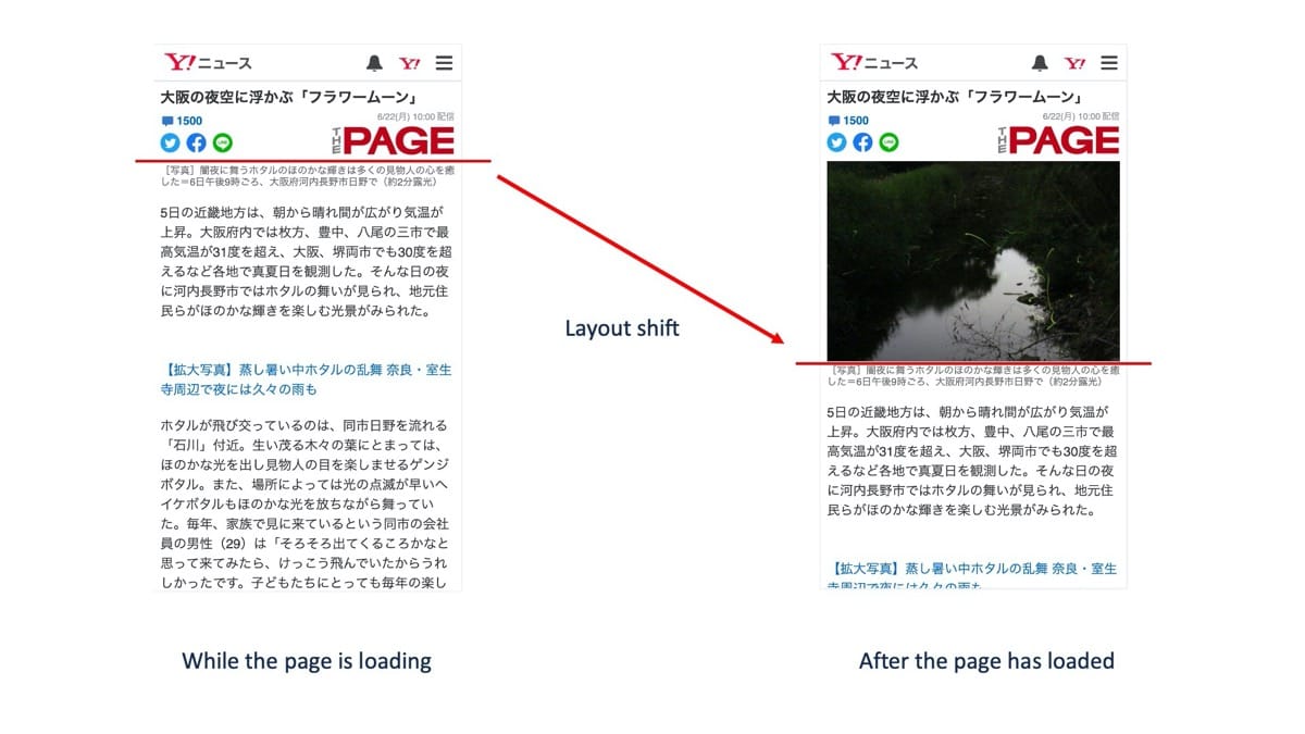
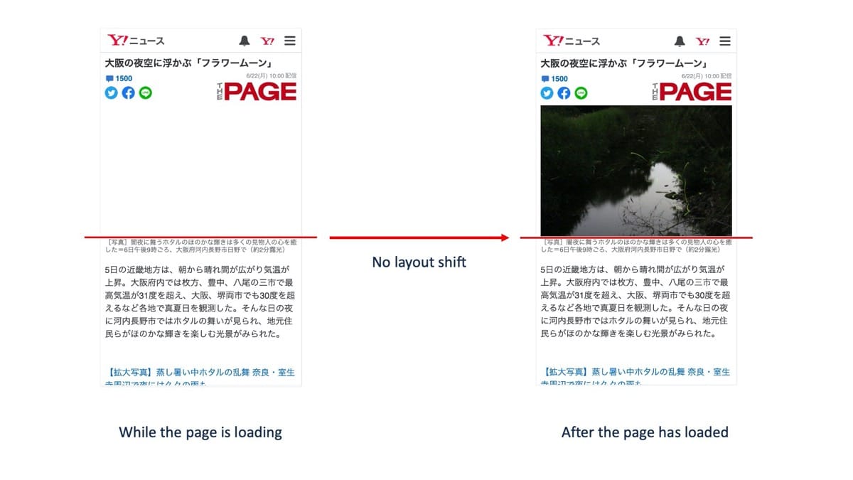
As you can see in the pictures, the area to display the image was not secured before the image was loaded, and after the image was loaded, a layout shift occurred, causing the position of the text below the image to go off to the red line.
Improving the CLS
If the size of the image to be displayed is fixed, you can prevent it from experiencing a layout shift by placing an element to wrap it and specifying the width and height. Modern browsers allow you to specify the width and height of img elements and use the css aspect-ratio property. For details, refer to the following article.
Advent of Web Pages without Image Layout Shifts - mizdra’s blog (external website, in Japanese)
However, we had to have images displayed on our pages in compliance with the following requirements:
- Maintain the aspect ratio
- Allow images of various sizes and forms such as portraits and landscapes to be displayed
- Keep the width 100% to the parent element
- Display images whose height exceeds 300 px with a width to height of 300 px
- Set links on images
- Support modern browsers and older browsers such as those installed in iOS9
In our case, we could obtain the size of the image in advance, so we used the Aspect Ratio Boxes to solve the layout shift. You can use an aspect ratio box to secure the area for an image when you know its aspect ratio.
To prevent a layout shift using an aspect ratio box, create HTML/CSS codings like the pseudo codings below. For some CSS properties, you need to set values calculated according to the size of the image.
HTML
<div class=“imageWrap”>
  <a>
    <div class=“thumbWrap”>
      <div class=“thumb”>
        <img />
      </div>
    </div>
  </a>
</div>
CSS
.imageWrap {
  display: inline-block;
  width: /* The smaller value of "image width" or "width when the image height is 300px" */;
  max-width: 100%;
}
.thumbWrap {
  margin: 0;
  height: 0;
  overflow: hidden;
  background-color: #fff;
  position: relative;
  padding-top: calc(/* image aspect ratio */ * 100%);
}
.thumb {
  position: absolute;
  top: 0;
  left: 0;
  width: 100%;
  height: 100%;
}
.imageWrap is an element used to specify the width applied to the a element, which is its child element. Even if there are margins on the left and right of the image, the link area is set only on the image itself.
.thumbWrap is an element used to secure the area for an image. With it, you can secure the area for an image before the image is loaded. The important point here is to secure the image area by using padding-top. If you specify padding-top by using %, it applies the percentage to the width. In the example above, to display the image, setting its width at 100%, the value is set to 100% of the aspect ratio. position: relative is used to specify the position determined by position: absolute in .thumb as the reference.
And .thumb and its child element img are used at the end of the sequence to display the image in order to prevent a layout shift from occurring with various image sizes.
By implementing these measures, the area for the image is secured before the image is loaded as shown in the pictures below, preventing a layout shift from occurring.
Achievements
With the measures mentioned above for improving our CLS, as well as other measures, we achieved the following:
Improved CLS on Google Search Console
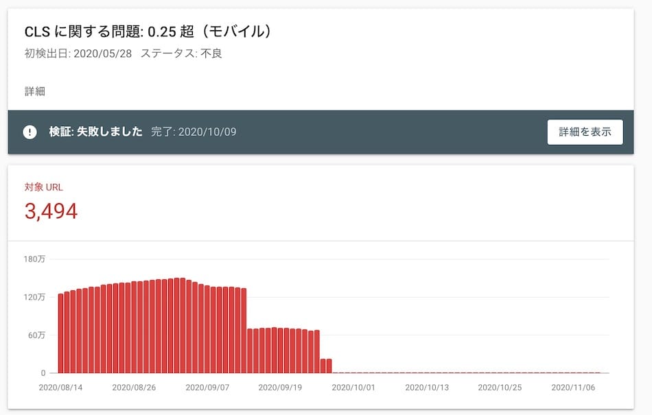
First, we were able to reduce the number of URLs of pages regarded as faulty on Google Search Console by about 98% (measurements on Google Search Console were updated a little while after we implemented the measures to solve our problems). For Lab Data (measurements used for development and metric purposes), our CLS improved from 0.2 to 0.
The measures we took also had positive effects on the following indicators, compared to before the measures were implemented:
| Indicator | Change |
|---|---|
| PV/Session | +15.1% |
| Session Duration | +13.3% |
| Bounce rate | 1.72 points improved |
It is surprising that the improvement of CLS directly resulted in improvements in other indicators. However, as described in the following article, analyses indicate that CLS correlates with bounce rate and time on site.
Cumulative Layout Shift in the Real World | NicJ.net (external website)
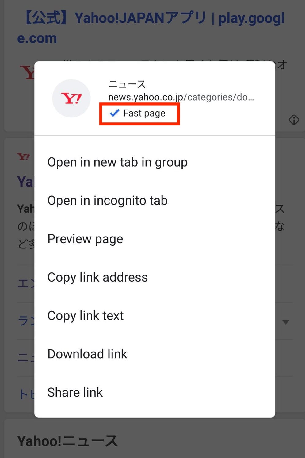
Thanks to the measures to improve our Core Web Vitals, our Yahoo! JAPAN News website is now labeled "Fast Page" on Android Chrome (as of December 2020. The fast page label is displayed by configuring Chrome settings).
Conclusion
I had been thinking about the need to solve layout shifts, but it remained a low priority, and we left the problem unsolved. However, the Core Web Vitals, which allowed us to visualize problems on the Google Search Console, offered a good chance to solve the layout shifts as well as other problems.
The measures we took also had positive effects such as increased time on site and increased PVs on our website. I think that these positive effects are the result of eliminating layout shifts, which caused stress for our readers, as well as other problems, and made the browsing experience on our website better, allowing visitors to read many more articles.
We provide our services, believing that the communication of incidents, issues, and problems in the world in the form of news will make the world better. We are pleased with the achievements we were able to make with the measures we implemented, which allows more visitors than ever to read our news articles.
For Yahoo! JAPAN services other than Yahoo! JAPAN News, we are also working on improving the Core Web Vitals. There is an additional report about another case of CLS improvement on Yahoo! JAPAN BEAUTY using a skeleton screen. Please take a look at this as well:
Core Web Vitals improved on Yahoo! JAPAN BEAUTY (in Japanese)
We will continue to improve our Core Web Vitals and the front-end performance of our web pages for better user experience through a technical approach to deliver news in more optimal ways.
Thank you very much for your kind attention.
Our case study introduced in Chrome Dev Summit 2020
Our case study for Core Web Vitals was introduced in Chrome Dev Summit 2020. Please take a look.
こちらの記事のご感想を聞かせください。
- 学びがある
- わかりやすい
- 新しい視点
ご感想ありがとうございました
